The beacon of New York City
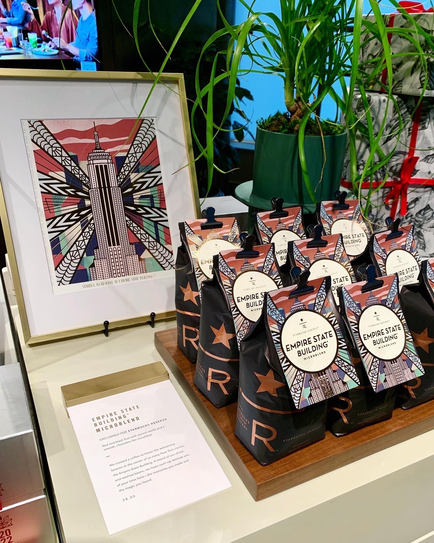
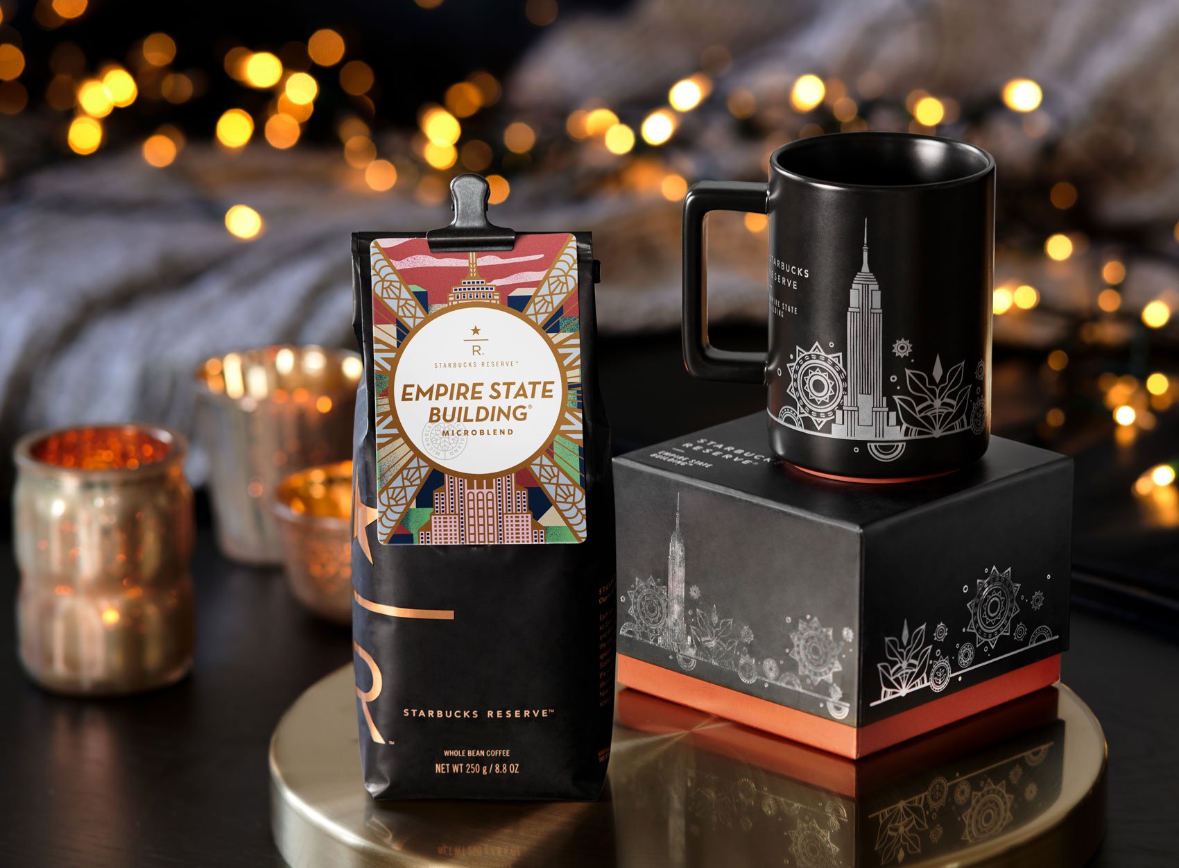
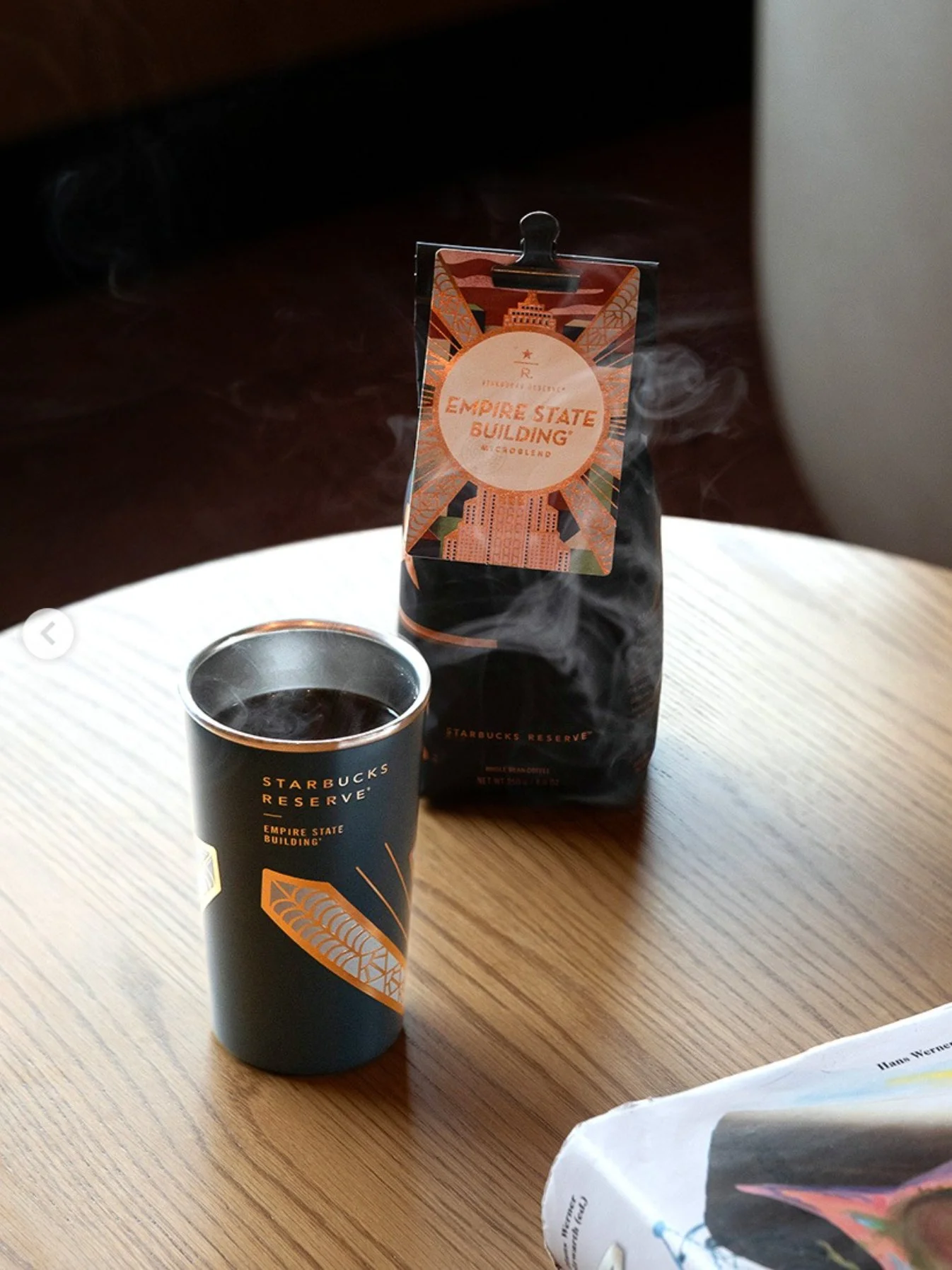
Empire state building microblend
Illustration + Creative Consult
Creative VP: Jen Quotson | Creative Director: Ben Nelson | ACD: Marissa Flores | Copywriter: Maria McNamara | Designer: Bonita Nongluk
Agency (for installation): Color Creative (AD Rose Julian) with support from Starbucks Art Program
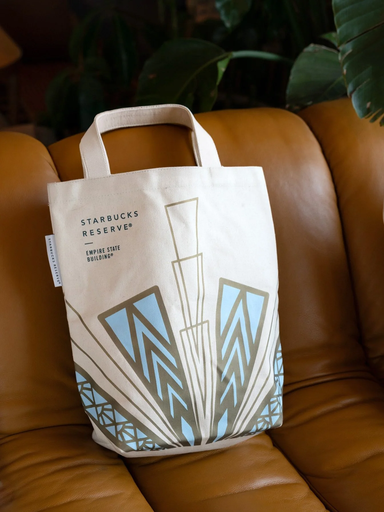
With a massive 3-story Starbucks Reserve store planned for the iconic Empire State Building, I was tasked to create a coffee card that represented the Empire State Building, New York City, and existing merchandise the Starbucks Creative Studio had designed for launch.
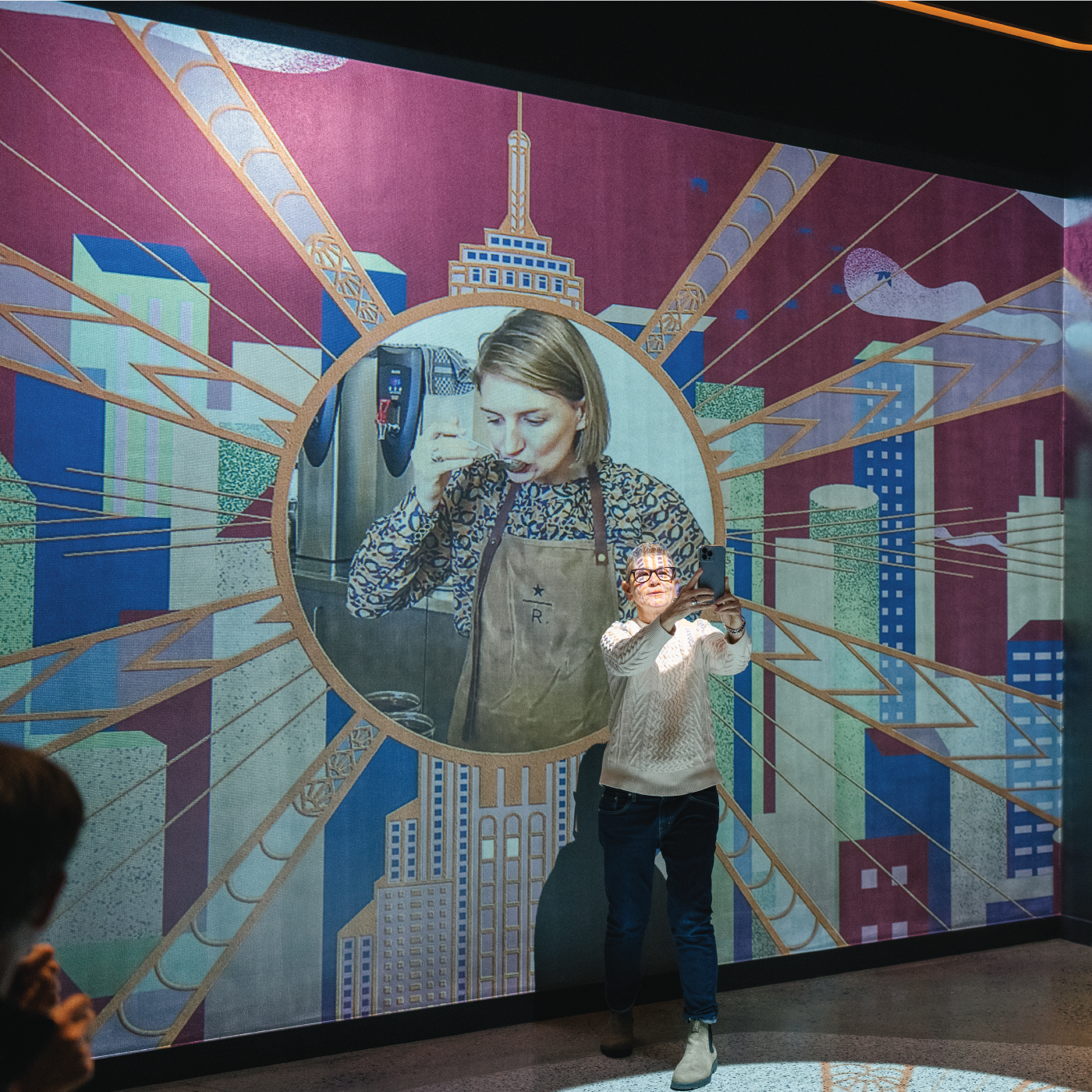
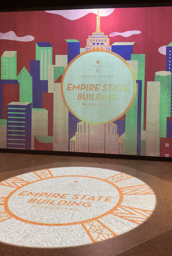
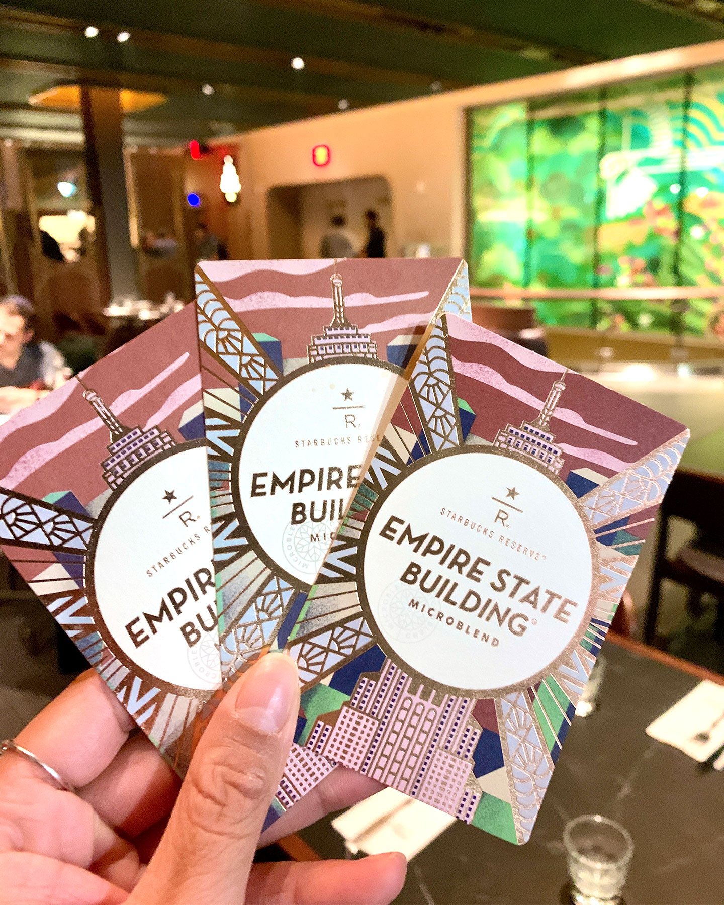
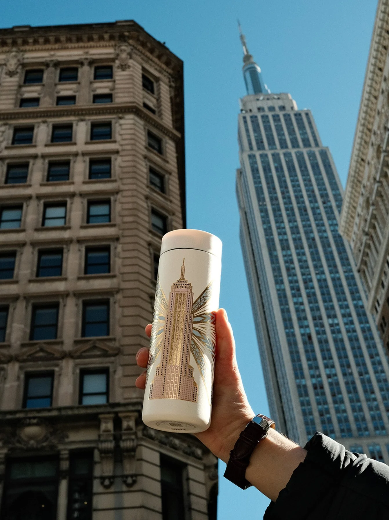
This coffee card would not only live on the Microblend’s bag, but as a gold-foiled print available for purchase and as an animated installation to be projected by the Experience Lounge. An additional merch collection debuted later using my original design as key art.
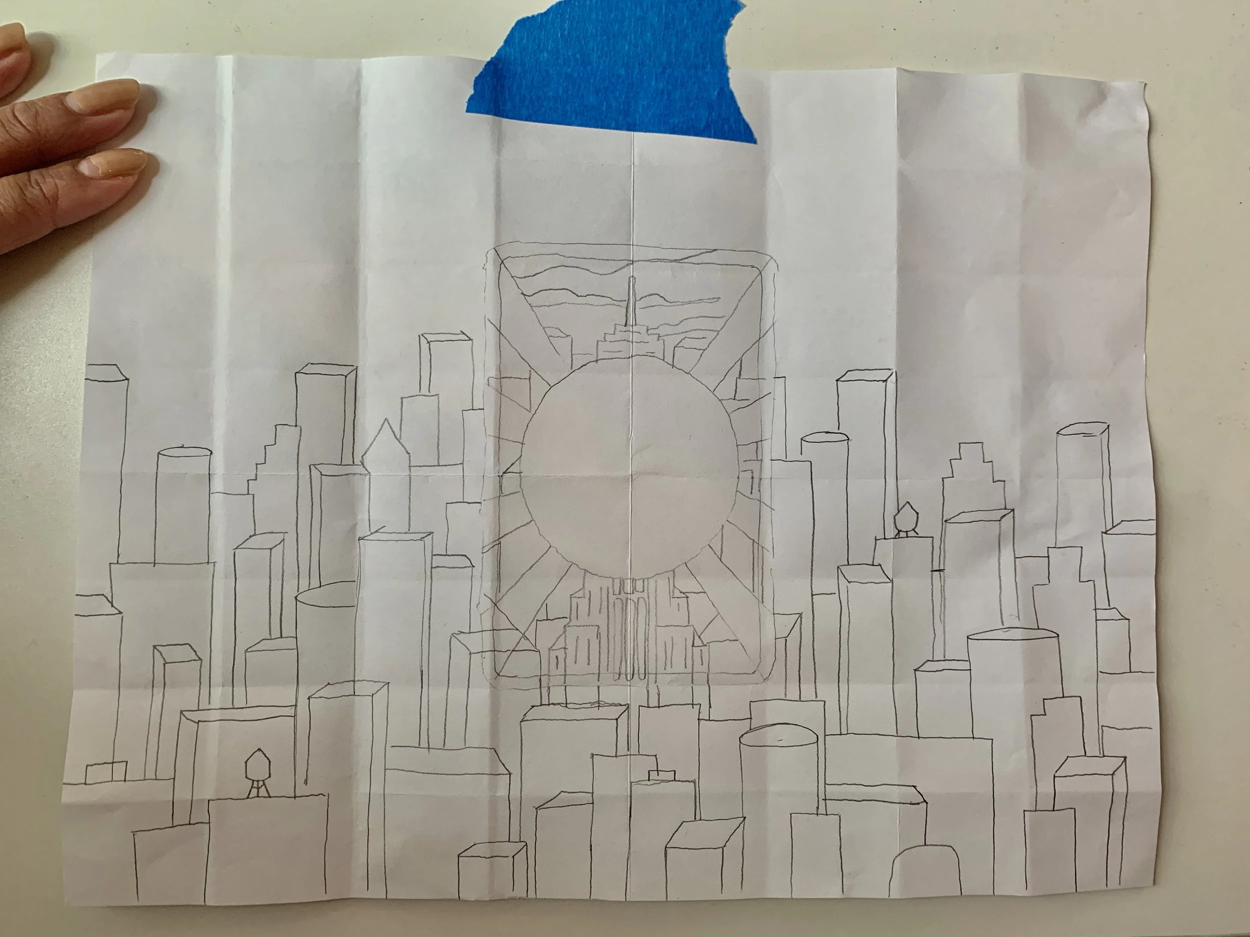
First thing’s first: research.
I headed over to the Empire State Building to better understand the visual language of the space: solar motifs, geometric rays, textural layering, and a strong grounding in the Art Deco movement. Emotionally, the environment was highly international with not only tourists from all over the world, but many staff members with global immigrant roots.


It was important for me to honor the working New Yorkers who keep the Empire State Building running everyday.
This maroon color is a reference to their iconic uniforms. I actually went back to the building with my Pantone chips for the most accurate color match. Shoutout to Jonah for letting me color target his blazer!
Knowing how global the audience would be at this new Reserve store, I took inspiration from the signage throughout the building and came up with our “Cheers” border.
The card was translated to 7 different languages, ensuring that the work would be more accessible to our customers.
Amongst everything sold on opening day, the Microblend was the top selling item, delivering 4x forecast.
Not these nails on my portfolio

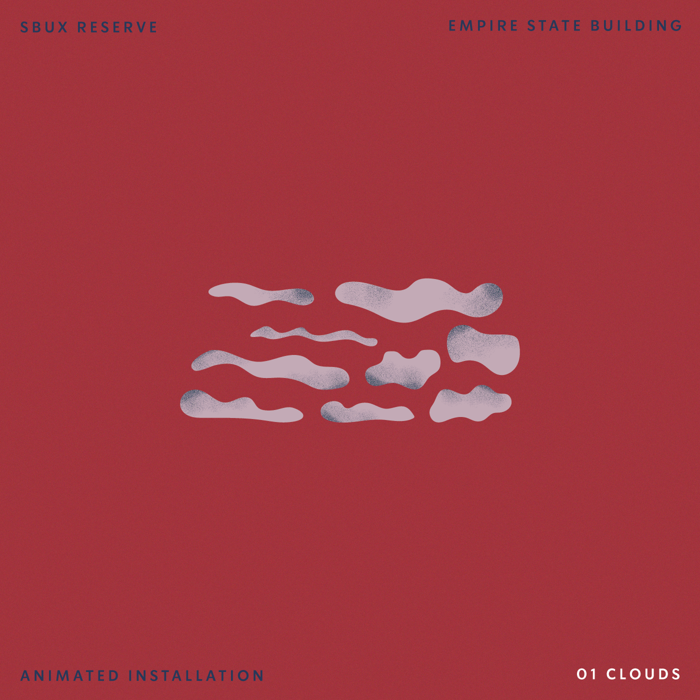
The installation shifts depending on time of day. For example, at night, the sky is a dark midnight blue while the morning sees a pink-to-maroon background. I provided an expanded version of the Reserve illustration, created new assets, and worked closely with Color Creative to ensure our vision was brought to life.